For my music magazine i created all of the pages using the software PhotoPlus X3. This software enabled me to create a well structured and layered music magazine that followed some of the conventions of music magazines available at the moment.
The first part of starting the creation my music magazine i decided to try some background colours first and decided that scarlet would be the colour of the background as it is dark enough to contrast well with the text in the foreground.
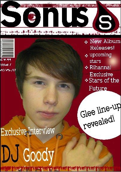
On the right hand side of the magazine the sub-titles are in the font Zolano Serif BTN and they go down te page from just underneath the logo to the circular shape next to the image of DJ Goody. i decided on putting the sub-titles in on the right hand side of the page becauase that is were the majority of other music magazines put there sub-titles. Also the space was already there from the image being placed on the right hand side of the page. The bullet points to the left of the text were put there to empahasis the points made at that section of the page.
Just below the sub-titles i decided to insert a circle from the software used and then added the text inside the circle. I did this to emphasis the text inside the circel and to maake the page more attractive to the audience. The circlular shape is situated around the middle of the page and is to the right hand side of the image of the artist DJ Goody.
On the front page of my music magazine i decided to take advantage of the softwware available and use some of the paint tools to make the magazine less plain to the reader. I did this by adding some paint effects using the stamp tool. The effects that i used were the people effects and the colour effects. i decided to use the colour effects because i felt that the images on the effects were suitable and fitted with my magazine. For example i used the people at the bottom of the page standing in a line to symbolise and suggest to the audience that the people stnading there are united in something in this case i hoped that it would create an example of everyone liking music. This is also the same reason why i used the stamp of the female and male facial features just underneath the title.
The eye inside the letter O of the title was put there to attract the audience attention as if the magazine title was looking at them and this i feel would make the audience attracted towards the magazine as well as inticing them to at least read the title of the magazine. There are also some smaller details in the magazine such as the small squares that are in the foeground of the bar that is situated just above the title. This i have done to attract the audience to the title of the magazine. The smaller faded dots on the right hand side behind the sub-titles are again there to attract the attention of the audience however, they also can be used for making the page look more interesting on the page. The line in the sub-titles is there for the same reason.
The bar-code is in the right hand corner of the page just underneath the title. I have placed it on its siode. I have done this because most other music magazine bar codes are placed on its side. the price is just underneath the barcode in the font Youngsook BTN. It is in this font to make it contrast with the other parts of the magazine. There is also the issue number and the date released underneath the bar-code. Most music magazines have these so i decided that i would follow the codes and conventions and add them to my front cover.
The title of the music magazine is done using the font colour black and the font of Gothic725 Blk BT. I used this font because is stood out well from the page and is an easy to read syle of font. The title of my magazine was created by searching for what the english word of sound was in greek. i choose greek because many of there words are relatively similar to the english language equivalents. The word sonus sounded good so i decided i would use that word as it is relevant to music. The logo in the top right hand side of the page was created using a raindrop shape from the software i used when creating my magazine. I decided to have a logo beacause i felt that it would improve the front of the magazine and would make it easily distinguishable from other magazines. i used the same colours on the logo that i used for the front page as if i had used a different colour scheme it would have clashed with the page.
The image of the artist in the middle of the page is a medium close up of a fictional artist. The image was taken using a canon powershot A480. The image was taken originally with a green screen in the background. The green screen was used as it makes it easier to elimninate the colour from the background and replace it with a new colour which in this case was scarlet. The image was then inserted into the document were i cut the background and then inserted it onto the front page of my music magazine with the scarlet background. I then accompanied the image with a title underneath the image that was relevant to the image.i also edited the image of the person slighlty by tweaking the hair on his head so it looked more proffesional as the hair was sticking out to much in some places I placed this title underneath and to the left of the image as i did not wish to restrict the view of the reader of the image. I used the font Zolano Serif BTN for this title. i also altered the view of the text as i felt a normal plain white text would be to plain for the front page of my music magazine. I did these alterations by tilting the font anti-clockwise slightly and changeing the colour of the word DJ to black instead of white. I did this to empahsis the word and bring the readers attention to it the title. On the right hand side of the magazine the sub-titles are in the font Zolano Serif BTN and they go down te page from just underneath the logo to the circular shape next to the image of DJ Goody. i decided on putting the sub-titles in on the right hand side of the page becauase that is were the majority of other music magazines put there sub-titles. Also the space was already there from the image being placed on the right hand side of the page. The bullet points to the left of the text were put there to empahasis the points made at that section of the page.
Just below the sub-titles i decided to insert a circle from the software used and then added the text inside the circle. I did this to emphasis the text inside the circel and to maake the page more attractive to the audience. The circlular shape is situated around the middle of the page and is to the right hand side of the image of the artist DJ Goody.
On the front page of my music magazine i decided to take advantage of the softwware available and use some of the paint tools to make the magazine less plain to the reader. I did this by adding some paint effects using the stamp tool. The effects that i used were the people effects and the colour effects. i decided to use the colour effects because i felt that the images on the effects were suitable and fitted with my magazine. For example i used the people at the bottom of the page standing in a line to symbolise and suggest to the audience that the people stnading there are united in something in this case i hoped that it would create an example of everyone liking music. This is also the same reason why i used the stamp of the female and male facial features just underneath the title.
The eye inside the letter O of the title was put there to attract the audience attention as if the magazine title was looking at them and this i feel would make the audience attracted towards the magazine as well as inticing them to at least read the title of the magazine. There are also some smaller details in the magazine such as the small squares that are in the foeground of the bar that is situated just above the title. This i have done to attract the audience to the title of the magazine. The smaller faded dots on the right hand side behind the sub-titles are again there to attract the attention of the audience however, they also can be used for making the page look more interesting on the page. The line in the sub-titles is there for the same reason.
The bar-code is in the right hand corner of the page just underneath the title. I have placed it on its siode. I have done this because most other music magazine bar codes are placed on its side. the price is just underneath the barcode in the font Youngsook BTN. It is in this font to make it contrast with the other parts of the magazine. There is also the issue number and the date released underneath the bar-code. Most music magazines have these so i decided that i would follow the codes and conventions and add them to my front cover.
No comments:
Post a Comment