Planning and Preparation
Front page planning.

There will small details underneath the main image on the
page as well as underneath the main title. This will be there as the page will look quiet blank with the just the image and the text. The logo will be in the top right hand side of the page. The logo was created as many of the magazines have a logo that is clearly recognisable or the masthead is the logo that the magazine is noticeable by. In my magazine I intend to have a mixture of both these styles of logo. The circle that I have labelled in the design on the left will be place there their to enhance the page and to make it look more interesting to the reader.
The main image will take up most of the space as this is similar to the other magazines that I have seen and researched. Nearly every magazine that is on sale and is received by a large audience has this feature. So my magazine will follow the codes and conventions of the music magazine industry.
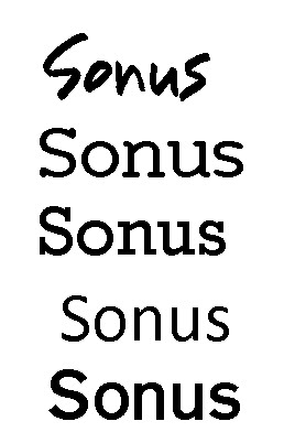
Font ideas for my masthead.

For my masthead font i decided to choose 5 clear fonts then decide on what would suit my magzaine the best. In the end i decided on the Gothic 725 Blk Bt which is last on th elist because i felt that it would give my magazine a clearer look about it than the others. Also the style is not over complicated like it is the Youngsook font at the top of the list. I feel that this font will maximize the effectiveness of the masthead and give a clear representation of what i'm trying to achive by having this masthead which is a clear and easily read magazine.
Font ideas for my masthead.
For my masthead font i decided to choose 5 clear fonts then decide on what would suit my magzaine the best. In the end i decided on the Gothic 725 Blk Bt which is last on th elist because i felt that it would give my magazine a clearer look about it than the others. Also the style is not over complicated like it is the Youngsook font at the top of the list. I feel that this font will maximize the effectiveness of the masthead and give a clear representation of what i'm trying to achive by having this masthead which is a clear and easily read magazine.
No comments:
Post a Comment