Wednesday, 6 April 2011

Front page and evaluation.

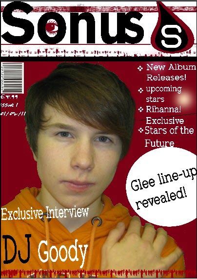
For my music magazine i created all of the pages using the software PhotoPlus X3. This software enabled me to create a well structured and layered music magazine that followed some of the conventions of music magazines available at the moment.
The first part of starting the creation my music magazine i decided to try some background colours first and decided that scarlet would be the colour of the background as it is dark enough to contrast well with the text in the foreground.
The title of the music magazine is done using the font colour black and the font of Gothic725 Blk BT. I used this font because is stood out well from the page and is an easy to read syle of font. The title of my magazine was created by searching for what the english word of sound was in greek. i choose greek because many of there words are relatively similar to the english language equivalents. The word sonus sounded good so i decided i would use that word as it is relevant to music. The logo in the top right hand side of the page was created using a raindrop shape from the software i used when creating my magazine. I decided to have a logo beacause i felt that it would improve the front of the magazine and would make it easily distinguishable from other magazines. i used the same colours on the logo that i used for the front page as if i had used a different colour scheme it would have clashed with the page.
The image of the artist in the middle of the page  is a medium close up of a fictional artist. The image was taken using a canon powershot A480. The image was taken originally with a green screen in the background. The green screen was used as it makes it easier to elimninate the colour from the background and replace it with a new colour which in this case was scarlet. The image was then inserted into the document were i cut the background and then inserted it onto the front page of my music magazine with the scarlet background. I then accompanied the image with a title underneath the image that was relevant to the image.i also edited the image of the person slighlty by tweaking the hair on his head so it looked more proffesional as the hair was sticking out to much in some places I placed this title underneath and to the left of the image as i did not wish to restrict the view of the reader of the image. I used the font Zolano Serif BTN for this title. i also altered the view of the text as i felt a normal plain white text would be to plain for the front page of my music magazine. I did these alterations by tilting the font anti-clockwise slightly and changeing the colour of the word DJ to black instead of white. I did this to empahsis the word and bring the readers attention to it the title.
On the right hand side of the magazine the sub-titles are in the font Zolano Serif BTN and they go down te page from just underneath the logo to the circular shape next to the image of DJ Goody. i decided on putting the sub-titles in on the right hand side of the page becauase that is were the majority of other music magazines put there sub-titles. Also the space was already there from the image being placed on the right hand side of the page. The bullet points to the left of the text were put there to empahasis the points made at that section of the page.
Just below the sub-titles i decided to insert a circle from the software used and then added the text inside the circle. I did this to emphasis the text inside the circel and to maake the page more attractive to the audience. The circlular shape is situated around the middle of the page and is to the right hand side of the image of the artist DJ Goody.
On the front page of my music magazine i decided to take advantage of the softwware available and use some of the paint tools to make the magazine less plain to the reader. I did this by adding some paint effects using the stamp tool. The effects that i used were the people effects and the colour effects. i decided to use the colour effects because i felt that the images on the effects were suitable and fitted with my magazine. For example i used the people at the bottom of the page standing in a line to symbolise and suggest to the audience that the people stnading there are united in something in this case i hoped that it would create an example of everyone liking music. This is also the same reason why i used the stamp of the female and male facial features just underneath the title.
The eye inside the letter O of the title was put there to attract the audience attention as if the magazine title was looking at them and this i feel would make the audience attracted towards the magazine as well as inticing them to at least read the title of the magazine. There are also some smaller details in the magazine such as the small squares that are in the foeground of the bar that is situated just above the title. This i have done to attract the audience to the title of the magazine. The smaller faded dots on the right hand side behind the sub-titles are again there to attract the attention of the audience however, they also can be used for making the page look more interesting on the page. The line in the sub-titles is there for the same reason.
The bar-code is in the right hand corner of the page just underneath the title. I have placed it on its siode. I have done this because most other music magazine bar codes are placed on its side. the price is just underneath the barcode in the font Youngsook BTN. It is in this font to make it contrast with the other parts of the magazine. There is also the issue number and the date released underneath the bar-code. Most music magazines have these so i decided that i would follow the codes and conventions and add them to my front cover.




Monday, 4 April 2011

Double page planning

Double page planning
For my double page I plan to have an image of the artist of my selection on the left-hand side of the page as it is with most magazines. The masthead of the page will be along the left hand side of the left page and will continue up that page and move over to the top right hand side of the right page.
The text will be in two text blocks on the right hand page and will fill the whole page. This is consistent with the majority of other music magazines.  The image on the left hand page will fill up the whole page apart from the masthead which will be to the left of the page. The image will be a shot of the artist lokking directly out of the page and into the readers eyes as is consistent with other music magazines. The shot will be a long shot of the artist so the whole artist will be in view on the page.

Thursday, 31 March 2011

Contents page planning


Contents Page planning
            For my music magazine contents page I have decide to have a similar layout compared to the magazine contents pages which I researched, Rolling Stones, and Q magazines. I plan to follow the magazine codes and conventions by having the image on the right hand side of the page with the text on the left hand side of the page. The title will be in the top left similar to other music magazines and the date and issue number in the contents page not on the front page for the reason that I believe that the front page should be as much about what is in the actual magazine not what issue the magazine was or when it is released.
There will be an editor’s note underneath the contents in the bottom left hand side of the page. It will be at the bottom of the page because it should be less important than the main stories that the reader should be more interested in. Again this is a similar to what the small texts role is in the contents page. It will be about something to do with what is to come within the magazine or a smaller sample of a larger story inside the magazine. The image will be a medium close up of a artist that will be fictional looking out at the reader much like in other magazines.

Front page planning

Planning and Preparation

Front page planning.


For the front page of my music magazine I decided to lay it out with the text on the right hand side of the page and the image on the left hand side of the page. The title will be in the top left hand side of the   page as it is with the magazines that I researched .e.g. Q magazine.
There will small details underneath the main image on the
page as well as underneath the main title. This will be there as the page will look quiet blank with the just the image and the text. The logo will be in the top right hand side of the page. The logo was created as many of the magazines have a logo that is clearly recognisable or the masthead is the logo that the magazine is noticeable by. In my magazine I intend to have a mixture of both these styles of logo. The circle that I have labelled in the design on the left will be place there their to enhance the page and to make it look more interesting to the reader.
The main image will take up most of the space as this is similar to the other magazines that I have seen and researched. Nearly every magazine that is on sale and is received by a large audience has this feature. So my magazine will follow the codes and conventions of the music magazine industry.


Font ideas for my masthead.


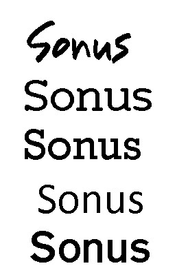
For my masthead font i decided to choose 5 clear fonts then decide on what would suit my magzaine the best. In the end i decided on the Gothic 725 Blk Bt which is last on th elist because i felt that it would give my magazine a clearer look about it than the others. Also the style is not over complicated like it is the Youngsook font at the top of the list. I feel that this font will maximize the effectiveness of the masthead and give a clear representation of what i'm trying to achive by having this masthead which is a clear and easily read magazine.

Research for Double page spread.

Research on double-page spread.

            In the double page spread of Q magazine the image that is on the left hand side of the page is a medium close up shot of the artist lady GaGa. All of the text is situated on the right hand side of the page this gives a significant space for both the image and the text. This is done to maximize the space that is used on the page and also not to make the page look like it is filled up with to much text or not enough images. The contents page is laid out like this because the reader does not wish to be inundated with lot’s of text as it makes the page look dull and neither should there be to many images because the reader would then feel that the interview is not very well informed and will not satisfy the expectations of a main feature page in a magazine.
            The image is a medium close up shot of the top half of Lady GaGa . She is looking at the reader through the page and this is consistent with many other mages in magazines involving an artist or person. The image is an artistic photograph because the image is in Black and white. This suggests that the photographer was going for a much more artistic view of the artist as this is generally what a photographer using a black and white effect would be going for.
            In the text on the right hand side of the page is in a small font as it maximizes the space available. It also fills the page as in magazine there is generally not very many blank spaces or any spaces at all. The text contrast goes well with the white background as the font is black and this makes it easier to read. Also starts of new paragraphs have a much bigger font size used for the first letter of that particular paragraph.
             At the top of the right page there is a title of the page and who the page is about. It gives the reader a quick and easy to read title as it is clearly distinguishable title compared to the rest of the page. In the centre of the page there is big red letter L. This is there again to emphasis what the article in the magazine is about., Lady GaGa. The text is three clear blocks on the page that go down the page starting on the left hand side. In conclusionthe page is well set out with a clear and easy distinguishable layout. It should be like what my double page spread should look like.

Wednesday, 30 March 2011

Music magazine contents research.

Music magazine research contents page.

The magazines that I will research and asses for ideas and influences for my music magazine front cover are Q magazine and rolling stones magazine.
In the Q magazine front cover there is a black line across the top of the page. This is done to allow the title of the page to be seen in a bold white font at the top of the page. The Q magazine logo is in the top left hand side of the page to follow up the word contents so it is the Q contents page. The date is situated in the right hand top corner of the page. This is done because it allows the reader to see what issue they are reading and to make the stories associated with the date that is there. This means that the reader knows whether or not that the stories that they are reading are in date or not.
On the right hand side of the contents page there is an image of a band called The Courteeners. They are viewed looking into the space of the image into the left hand side of the page. This is also how many other images that are in magazines are used. They often have the image of the artist on one side of the shot looking into the space on the other side. In the image at the bottom left hand side of the shot the reader is able to easily distinguish what the band are called because the content text sticks out from the left hand side of the page from the contents block. Also it gives the artists who are in the shot extra publicity as they are separate from the rest of the contents and are therefore much more easily recognised by the reader as more important.
The contents block on the left-hand side is in a straight line that stretches from the just below the top of the page to the bottom of the page. It is in a very formal style and is therefore extremely easy for the audience to read it. It is attractive to the audience as it is in a good contrast with the image on its right hand side. This is because the image is quite dark whereas the contents are quite light. The numbers on the content pages are a different colour compared with the rest of the text. This is done to emphasise the numbers and make them stand out more than the actual content text. I think this could be done so that when browsing the contents page for a particular section that appeals to you it is easier to just scan the page number allowing for a quick yet easy method of finding a page that is of interest to the audience.
There are different content titles on the page that use the same colour scheme as the Q magazine logo. These include “features” and “every month.” They are there as they break down the contents into different sections with regular appearances in the magazine and features that are unique to that particular edition of the magazine.
In the contents section of Q magazine there is also a special section about a band called Oasis. This section of the contents is viewed by the audience to be specifically important. This is because the special section is highlighted with a gold border around it which can be related by the audience to as a rare section of the magazine as gold is a rare and sought after the metal.

In the rolling stones contents page it is laid out in a very similar way to the Q magazine contents. For example the masthead of the page is in the top left hand corner of the page and the contents themselves run underneath them. The colour scheme is again similar to Q magazine due to the fact that the text is dark compared to the background this makes it easier to read.
On this contents page the image that is related to the bottom right hand text on the page takes up a large section. The image is a also accompanied by a description of what the picture is about in the top left hand side of the actual image itself. There is also a smaller snippet of the story that is in the magazine directly underneath the image.
The numbers on both the magazines are a different colour compared to the text that they relate to this creates a clear distinction from the text. There is a picture of Beyonce at the top left hand of the page. That relates to the text underneath it. The picture is there at the top of the page at the start of the contents because it can be viewed as more important than the rest of the contents. This can also b
e viewed as a special section as the text underneath writes about the top fifty or so earners  in the music industry.
In a summary both magazines have a very similar layout and I think that I will use this basic design as a template for my contents page. These conventions of the music magazine industry are almost universal. Such as the fact that the contents are always on the left and the image is on the right. The images are very large and take up most of the page. And the title is always at the top of the page to the left of the page.


Thursday, 24 March 2011

Front page reasearch main task

Research for Music magazine.

For the research into my music magazine I will look at other existing professional music magazines to get inspiration and ideas into what I could put into my music magazine. The parts of the magazine that I will look at are the front cover, contents page and the double-page spread. I will evaluate them and see why they have used certain fonts, why the pictures are where they are and how the pages are spread out.

Front Page
            In the front cover of q magazine the title of the magazine is in the top left hand side of the page. This is consistent with other music magazines such as the NME special edition cover seen below q magazine.
The colour schemes in both the magazines are roughly the same they both use either a dark background with lighter text in the foreground or the opposite. This is done so the text and pictures have a good contrast and can therefore both be seen with relative ease. Both of the artists shown are filling up most of the front page and there is very little text around there facial features. This is done to emphasise there importance on the front page. Both of the artists names are used in bold writing again to show the reader that there is a major item or interview about them in the magazine. The text of the artists name is situated at roughly at the bottom part of the page to show its importance to the reader and to show that the main story is about them.
The sub texts are in the top right and along the left hand side of the magazine to stop the overcrowding of the middle of the page which then allows the artists picture to be left on it’s own allowing for a better view of the artists.
In q magazine there is an advertisement at the bottom of the magazine at a slight upward slant to the rest of the page.
The pictures of the artists are both very large and take up most of the front page there is generally another picture on the front page but it is generally much smaller than the main feature picture.
The subtitles that are in both magazines are specifically written to attract an audience towards them. For example in NME there is statement from the artist Florence which reads, “I would never have got through the X Factor auditions” this an extremely strange statement to make as she is a successful artist and the X Factor is a competition that promotes good singers. This means that the audience is enticed to buy that magazine as it is an eye catching line to make.
In Q magazine there are many artists’ names in the sub-titles so an audience may like that sort of music or the music that they like and see it on the front cover. By having a broad range of artist published on the front of there magazine it will attract people to it.
Also when they are advertising the freebies in the magazines they are always advertised in very bold and capitalised fonts. They draw exceptional attention as they stand out from the page. This is seen in Q magazine when the freebies that they are advertising are in a different colour from the rest of the front page and they also span the width of the front page.
The barcodes in both the magazines are both at a vertical angle to minimize the space that is taken up by them.
Also in a number of other magazine they have the words, “exclusive” and “special” these words create a response with an audience because it makes them think that the magazine that they are purchasing has something different and better than other magazines that are on sale. Also it attracts attention to a particular story often the story is something that the reader would not expect; it comes as a surprise to them.
The fonts that they use on the front page of the magazine are often in a completely and none related colour to the rest of the front page. This is done to make them stand out from the rest of the page and draw the audiences’ attention to them. Also the font style is very clear and they will often use they use the same font for the front page for nearly all texts. They do not change the font to much as it would crowd the page with a lot of items such as different fonts, colours, and pictures. It would make the magazine to difficult to read and no one would read it.
Generally in all magazine front covers the most important information is on the left hand side or right hand side of the page as this is how they are stacked on shelves in shops. It is on the left or right  because the magazines are overlapped over each other and  information be seen by the customers who will now be able to see what they want with the information on one side. Not in the middle of the page or at the bottom.